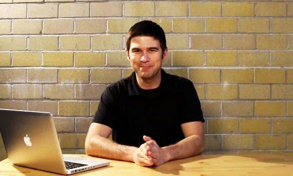
Last month I saw Clay Collins of LeadPages speak at an internet marketing party in San Diego and during his speech he revealed 5 conversion tips that can help any online business owner get more sales. Clay Collins is the founder of LeadPages, which is the world's easiest landing page generator. I use LeadPages in all of my online businesses, as it helps me to easily create landing pages and squeeze pages with ease, along with customizing them in any way that I want.
While I was looking over the notes I took during the Traffic & Conversion Summit, I came across the notes I took from Clay Collins and thought that I'd share them in a video blog. Below are the 5 conversion tips that I learned from Clay Collins.
(Click here to watch on YouTube)
1. A Two-Step Optin Process Converts Better


Well, what Clay Collins has discovered from LeadPages is that a two-step optin process actually converts better. With a two-step optin process, you wouldn't see the name and e-mail fields. Instead, you'd just see the “Get Instant Access” button. When you click on the “Get Instant Access” button, a pop-up would appear that then asks you for your name or e-mail address to proceed.
With all of the data that Clay Collins and his team has been collecting from LeadPages, this two-step opt-in process converts the best out of anything they've seen so far. It's actually increased conversions up to 60% on most landing pages.
In my new version of ProjectLifeMastery.com (which is currently being redesigned right now), I am moving over to the two-step optin process on everything. But, for an example of what a LeadPage looks like using the two-step optin process, go to this landing page that I have by clicking here.
2. The Best Days To E-mail Your List
Have you ever wondered what the best days and times are to e-mail your list?
Clay Collins and his team shared their data on this as well. They've discovered that the best days to e-mail your list are: Monday, Tuesday and Wednesday. During these days of the week, you will get the highest open rates and click-through rates. The best times during those days are: 4:00 AM to 3:00 PM Pacific Standard Time.
I found this data interesting and useful, as it will now help me get the most from the e-mails that I send out to my followers and customers.
3. Raw Photos Outperform Professional Photos
This conversion tip is somewhat counter-intuitive.
Do you know those professional looking photos that people use of themselves on their blogs or websites? Well, it turns out that those don't convert as well as a raw photo does. A raw photo would be a casual picture of you. You wouldn't using a picture of you wearing a suit and tie or have a professional photographer take the picture. Instead, it would be a picture of you wearing a t-shirt or just looking like a regular person.
It turns out this is more REAL for people and people are able to relate to this more.
4. Download MY Report Converts Better Than YOUR Report
Here's another interesting split test conversion tip. On your website or landing page, if you say something like “Get Your Report Here!”, it doesn't convert as well as saying “Get My Report Here!” The reason for this is because when people READ it, their brain understands “My Report” as actually being THEIR report. When you say, “Get Your Report”, the data shows that they have a disconnect with that and it doesn't convert as highly.
Isn't it amazing how these LITTLE things make such a big difference? That's the power of split-testing your websites and landing pages, as those little things that you wouldn't notice can make a big difference to conversions. That's why I love LeadPages too, because all of their templates are highly tested to convert as high as possible.
5. Use Lead Boxes In Blog Posts
This is a conversion tip that I learned recently that I've been experimenting with in all of my blog posts. LeadBoxes is something that was uniquely created by Clay Collins, which allows you to use the two-step optin process throughout text or any image. For example, if you click here, you will see what I mean.
LeadBoxes is a sneaky trick that I'll be using a lot more, which helps get more subscribers to your e-mail list fairly easily. The cool thing is, when people click on these links they aren't expecting to be asked for their e-mail address, which catches them by surprise while they don't have a “guard up” on things. Very cool.
Those are the 5 conversion tips that I wanted to share with you today. I absolutely love LeadPages and how easy it is to use – it's definitely helped me build my online business and I'll be incorporating more of their templates and features into this blog soon enough. If you're looking for something to use to easily create landing pages, squeeze pages, or webpages then I highly recommend LeadPages.


